Friday, February 8, 2013

wuslam - december slam ("button poetry is clearly the visual theme")

the last slam of the year! I didn't focus on a color scheme in general for this slam, and instead looked to really incorporate the button theme, because the host poets Sam Cook and Michael Lee are part of a group called Button Poetry. 
Everything was hand-drawn, and when I used Photoshop I used a crayon-wax brush in order to keep that sketchy/traditional feel. 

final version

initial sketches. I was exploring visually what I could do with the two poets. 

and then i stumbled upon the wonderful information that they were part of a group called "button poetry," so i went ahead to incorporate a button/circle visual theme into the poster. 

circles are always tricky though, so i spent a lot of time trying to figure out what to do with the layout. 

ended up settling on something close to that, just a little more compact. 

pencil sketch/lines; I wanted to keep a paper/traditional texture feel to the piece. 


here's a different color version. the blue's a little too teal and everything clashes too much, so i desaturated the colors, got rid of some of the shapes, and produced something much simpler. 

Wednesday, February 6, 2013

wuslam - november slam

Here's another poster for WUSlam. This one was done for the November Slam.

Went a little overboard with the "storm" theme, but it worked out. Done entirely in Photoshop. 


Some sketches/thumbnails! 


wupr illustration 02 ("wupr says stay green and alex says this cover was tricky")

I signed up to illustrate the cover for WUPR. The theme was "Wake Up," and the goal for the cover was to incorporate and explore the imagery of nature while staying in tune with the message of "stop hurting this planet/go green" theme (which I support 100%, coming from California and all). 

I drew the lines using pencil on normal sketchpad paper (which is the best sketch paper for my pencils that I've ever used) and colored it using Photoshop. I worked to maintain that traditional look because I think the texture has a really nice quality to it that I wanted to retain.) 

Sketches and process! 


Some notes I took after discussing with the Design Chief for WUPR about what to do with the cover. 

The original pencil sketch

in publication! 


sketchbook 03 ("i swear i'm alive")

good ol' moleskine: 


doodles from a normal spiral sketchbook (so no crazy page breaking going on): 


this is from a little horizontal sketchbook that i had. the long format was kind of weird to hold, but i liked the texture of the paper! most of this is just fun with letters: 


Friday, November 16, 2012

digital painting ("faron the water dragon gets a makeover")

It's always refreshing to look through your old drawings and get bitten by the redo-bug. I stumbled upon this old painting that I did of Faron, the dragon from Skyward Sword, and I wrote it down on my long list of "THINGS TO REDO."
this is the updated version: 


and this is the old one:

and a process gif! 


here's a process gif of another painting I did. I didn't have a lot of screenshots so the transition between the second to last frame and the last frame is a bit...abrupt. 


Wednesday, November 7, 2012

Graphic Design 06 - Get Out the Vote! ("Lolcat wants you to vote nao")

In Digital Design, our assignment was simply to create a vote poster. A lot of people came up with some really cool stuff!

some sketches and thumbnails

some rough drafts:

some rough drafts:


and, just for fun, Maru: 


WUPR Illustration 01 ("i have no shame with my political views")

For an issue of WUPR, we were tasked to illustrate an article of our choosing. I chose an article that was about the faults of the current GOP, mainly how it devolved from a party that stressed low-taxes and seeking energy sources within the country, to a party made up of conservative-right-wackos (Tea Party) and flip-floppers that utter gaffes every other sentence (Romney) whose party agenda is anti-everything. 
                             

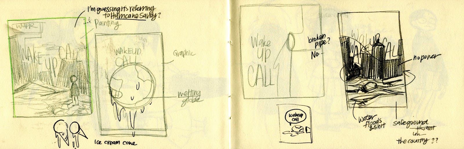
original sketches/thumbnails: 


I think I'm going to revise it in the future. The text could be better arranged, and I could do a better job with coloring. Maybe I'll even change the format/layout of it to better illustrate a sense of passed time?