


 |
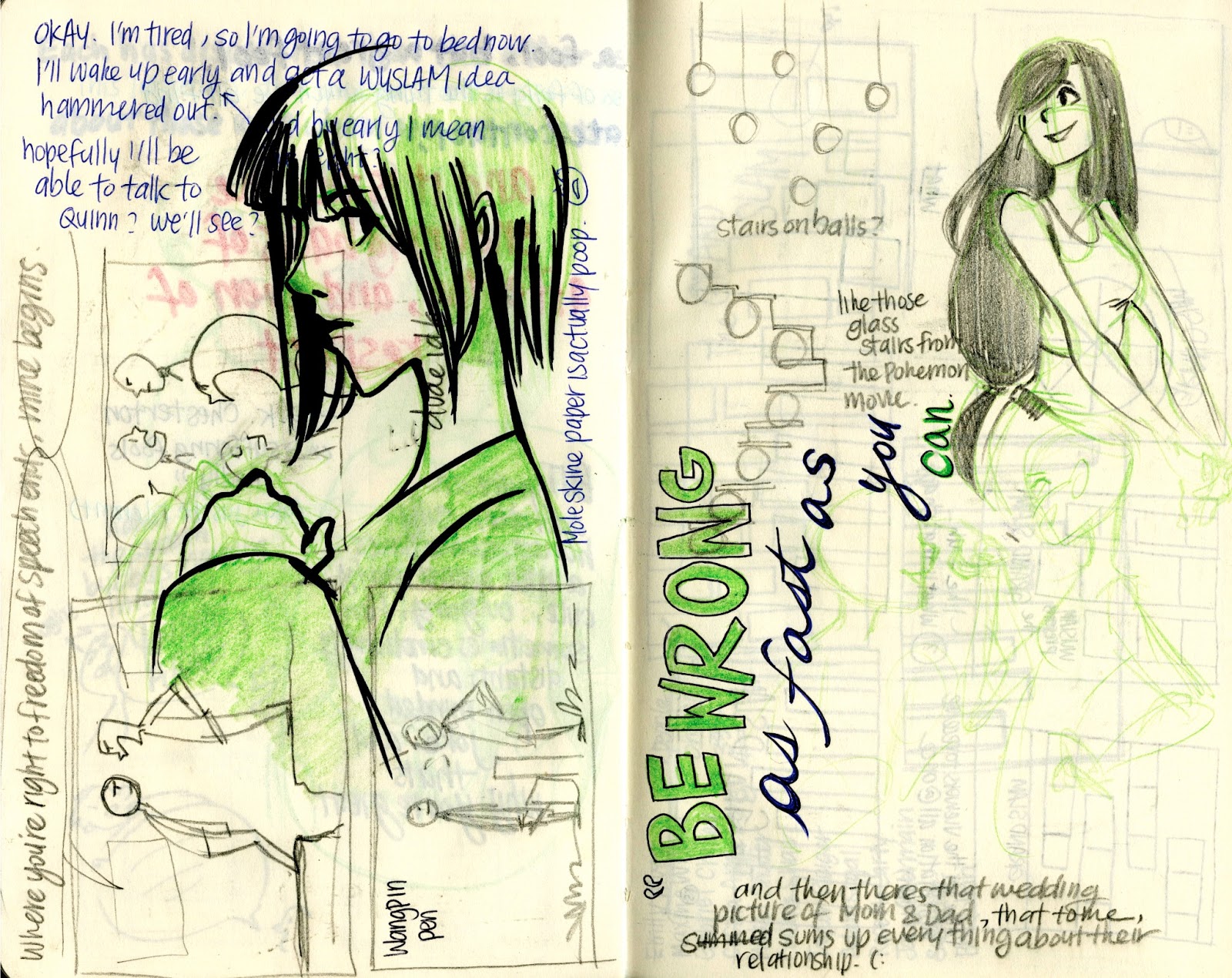
| Some initial sketches. I was trying to figure out how to show the "unite" aspect that the article discusses. Also, ignore the pages on the right, as those are my notes for typography. |
 |
| inked version |
 |
| (you have no idea how many struggles occurred, because my computer had crashed while I was working on this. as a result, I scrambled from computer to computer for the right fonts.) |
 |
| some initial sketches. i was just playing with basic visual ideas, because i felt that it would be the best way to tie together ten different poets. |
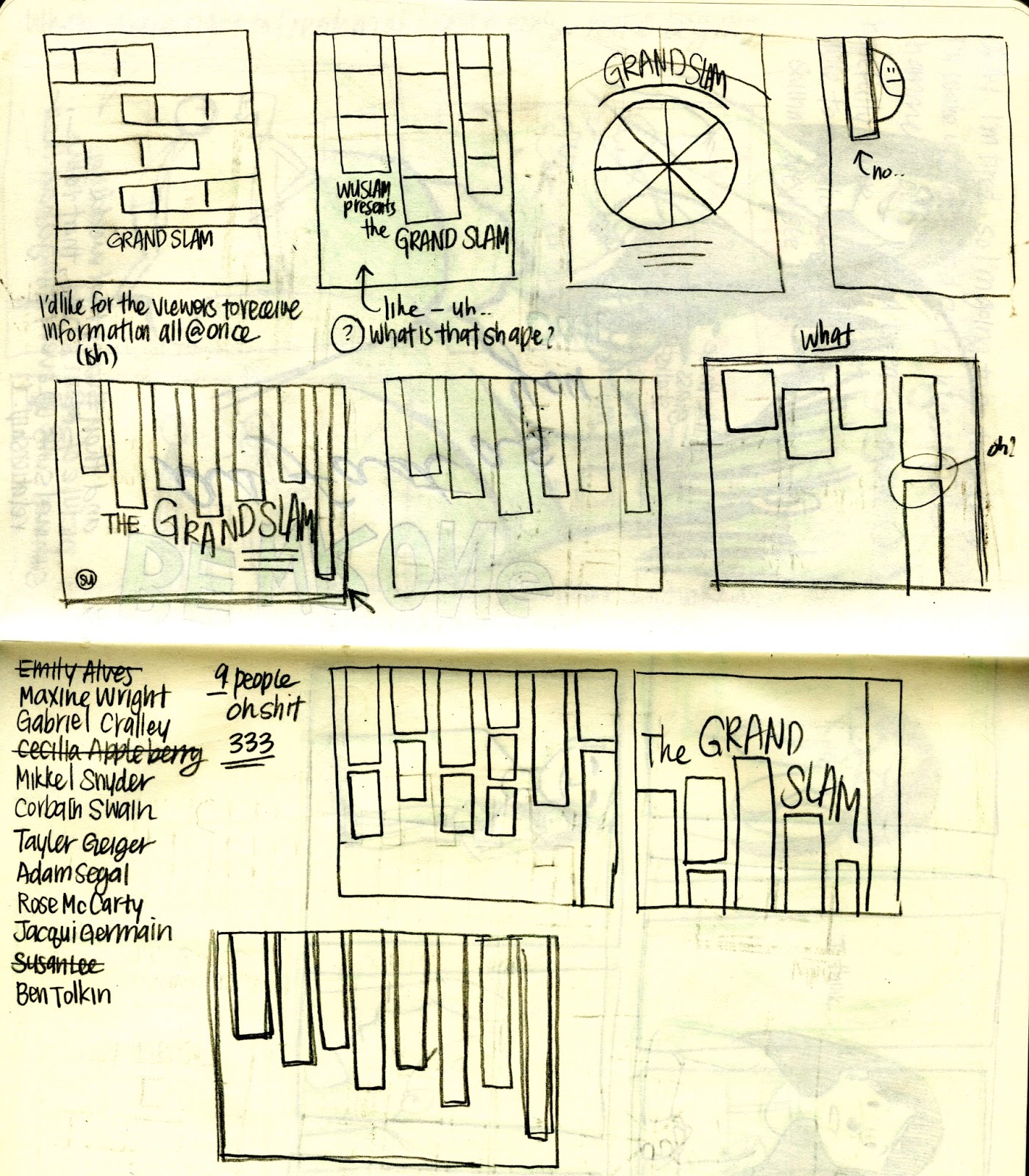 |
| went with a vertical rectangle piano keyboard looking thing. |
 |
| white had a nice visual effect but I liked the way the dark shapes on the poets sat against the black. |
 |
| sketches for individual posters! |


 |
| final version |
 |
| initial sketches. I was exploring visually what I could do with the two poets. |
 |
| and then i stumbled upon the wonderful information that they were part of a group called "button poetry," so i went ahead to incorporate a button/circle visual theme into the poster. |
 |
| circles are always tricky though, so i spent a lot of time trying to figure out what to do with the layout. |
 |
| ended up settling on something close to that, just a little more compact. |
 |
| pencil sketch/lines; I wanted to keep a paper/traditional texture feel to the piece. |
 |
| here's a different color version. the blue's a little too teal and everything clashes too much, so i desaturated the colors, got rid of some of the shapes, and produced something much simpler. |
 |
| Went a little overboard with the "storm" theme, but it worked out. Done entirely in Photoshop. |
 |
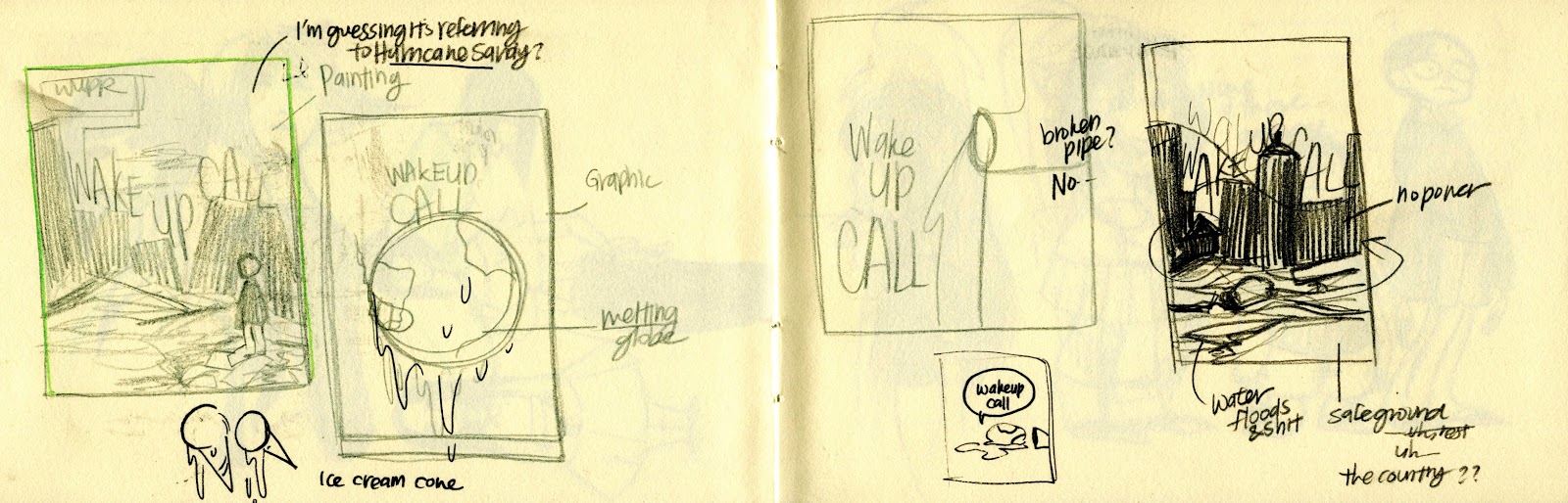
| Some sketches/thumbnails! |
 |
| I drew the lines using pencil on normal sketchpad paper (which is the best sketch paper for my pencils that I've ever used) and colored it using Photoshop. I worked to maintain that traditional look because I think the texture has a really nice quality to it that I wanted to retain.) |
 |
| Sketches and process! |


 |
| Some notes I took after discussing with the Design Chief for WUPR about what to do with the cover. |
 |
| The original pencil sketch |
 |
| in publication! |