ideas are under the cut!
Tuesday, July 1, 2014
Monday, June 2, 2014
Moved!
Hi! I don't updated blogspot anymore. You can find me at :
Sketchblog: www.chiumonster.tumblr.com
Portfolio: www.alexmchiu.com
Thanks a bunch!
Sketchblog: www.chiumonster.tumblr.com
Portfolio: www.alexmchiu.com
Thanks a bunch!
Sunday, March 10, 2013
exploration of space project ("down by the riverfront")
For a project, we could choose to go to either the Central West End, at the medical center, or to the riverfront by the St. Louis Arch. Hopefully by these images it's clear where i went!


font design project, "Rehab"
We were assigned into groups of four, and within our groups we were given adjectives. We had to research and compile different examples of typefaces that conveyed our respective adjectives. My group had "religious," "desperate," "nimble," and "aggressive." We took components from these four adjectives and created a font we called "Rehab." (haha)
.jpg)
 |
| full letter set |

some initial research sketches:


experimenting with different components:


 |
| letter set that I was primarily responsible for |


it would be the most fitting kind of vodka, obviously.
Monday, February 25, 2013


Friday, February 8, 2013
wupr illustration 03 ("unite")
The article that I signed up for was about unity in India over national tragedies and problems, and how it has been difficult in general to unite over many different issues because of the enormous diversity within the population. The article itself noted that the ability of the people in India to come together recently (specifically over the gang rape in Delhi) is somewhat of a symbol of a growing political movement in India, and that is the ability to unite over different social issues.

 |
| Some initial sketches. I was trying to figure out how to show the "unite" aspect that the article discusses. Also, ignore the pages on the right, as those are my notes for typography. |
 |
| inked version |
wuslam - THE GRAND SLAM ("enough said")
WOOHOO! The Grand Slam is only a week away, and I'm already pumped to go. This was one of the bigger projects that I got tasked with, because I had to make one main poster and 10 individual posters featuring all of the poets. I decided not to go with a hand-drawn feel and come up with something very graphic, simple, because my main goal was clarity, not necessarily style.
 |
| (you have no idea how many struggles occurred, because my computer had crashed while I was working on this. as a result, I scrambled from computer to computer for the right fonts.) |
 |
| some initial sketches. i was just playing with basic visual ideas, because i felt that it would be the best way to tie together ten different poets. |
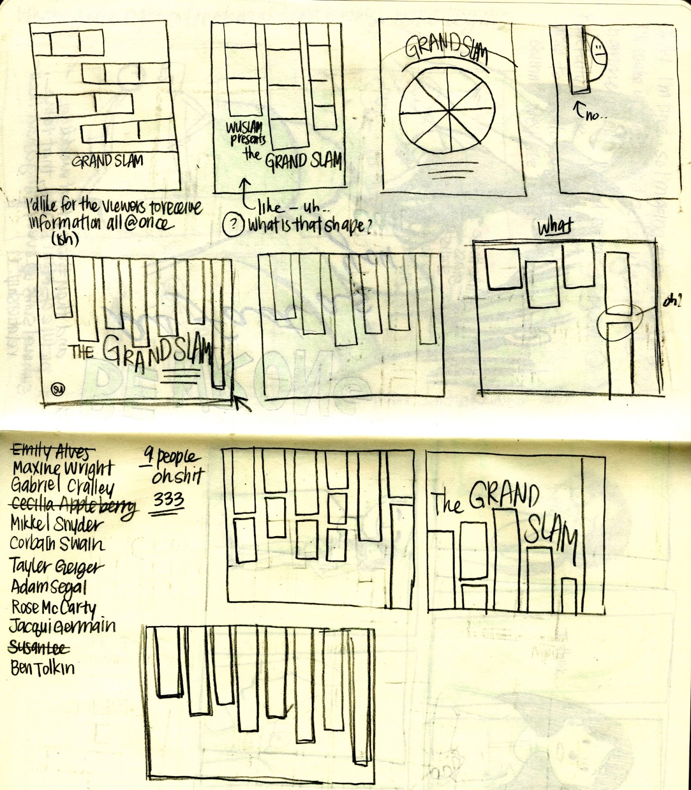 |
| went with a vertical rectangle piano keyboard looking thing. |
 |
| white had a nice visual effect but I liked the way the dark shapes on the poets sat against the black. |
 |
| sketches for individual posters! |


Subscribe to:
Comments (Atom)